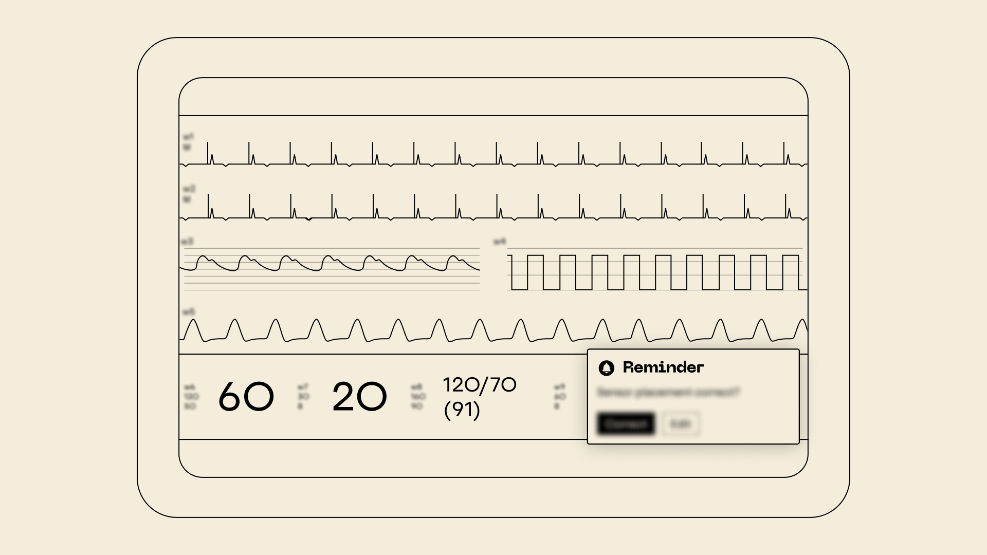
How can ICU users be supported in noticing and correcting sensor misalignment, without adding friction to routine workflows?
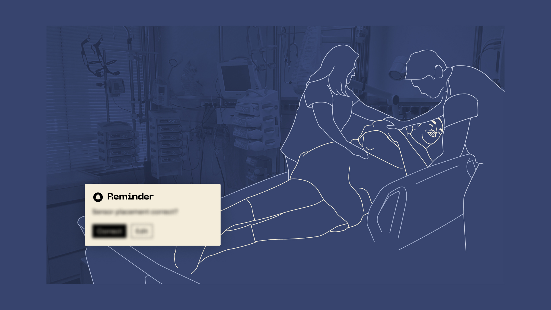
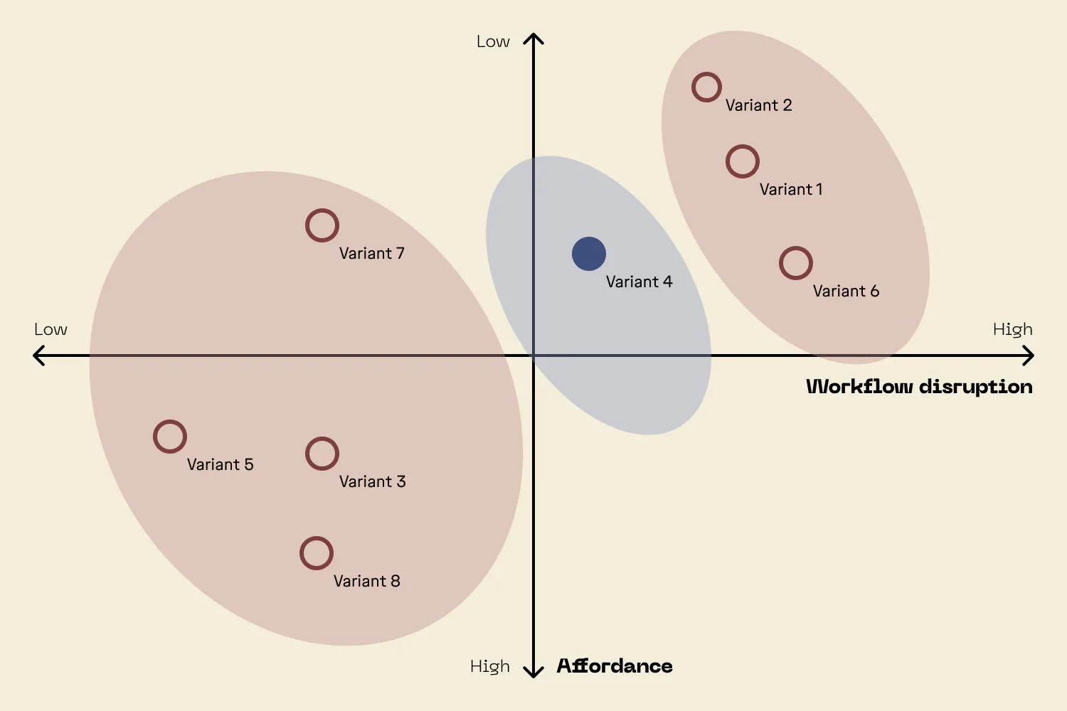
Risk Measure: Offset Indicator
As part of a client project in the critical care context, I led the UX contribution to a risk mitigation measure targeting sensor misalignment in physiological monitoring. The resulting UI element provides context-sensitive visual prompts and guided interaction to help users verify correct placement after possible patient movement or clinical interventions. I formatively evaluated the concept with clinical representatives, focusing on recognizability, relevance, and interaction design. Feedback confirmed its risk mitigation potential and guided refinements to visual hierarchy, spatial integration, and trigger logic. The work supported alignment with IEC 62366 usability standards and ISO 14971 risk requirements, contributing to safer and more intuitive monitoring interactions.