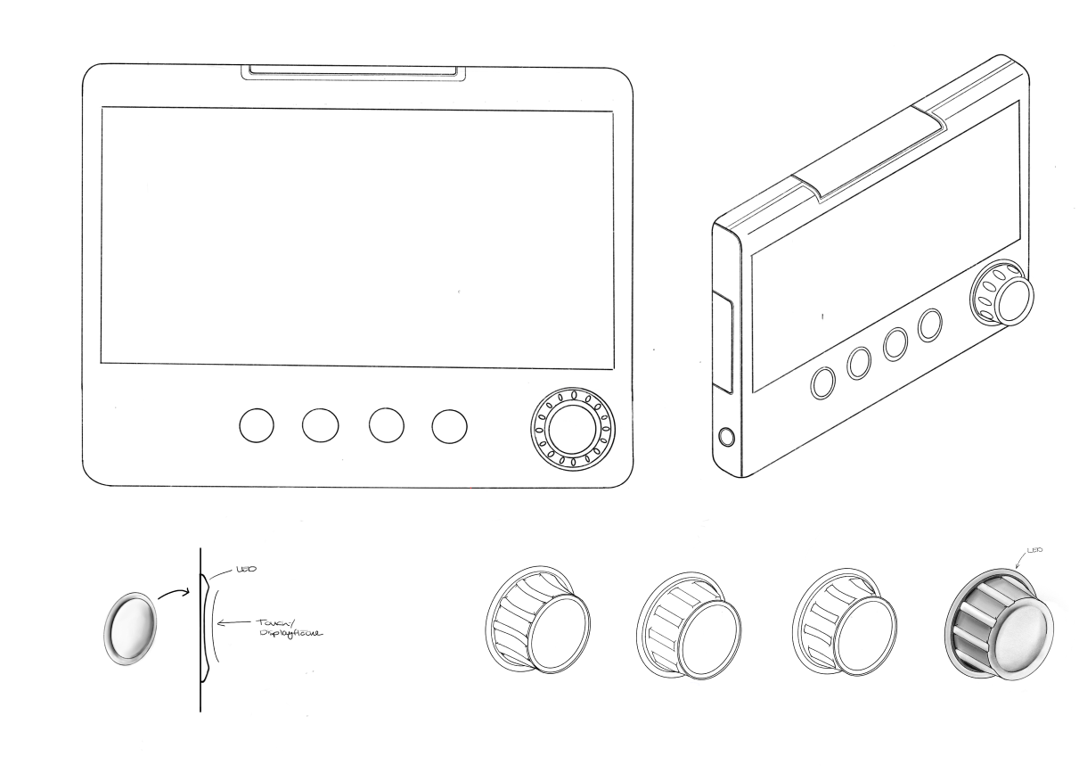
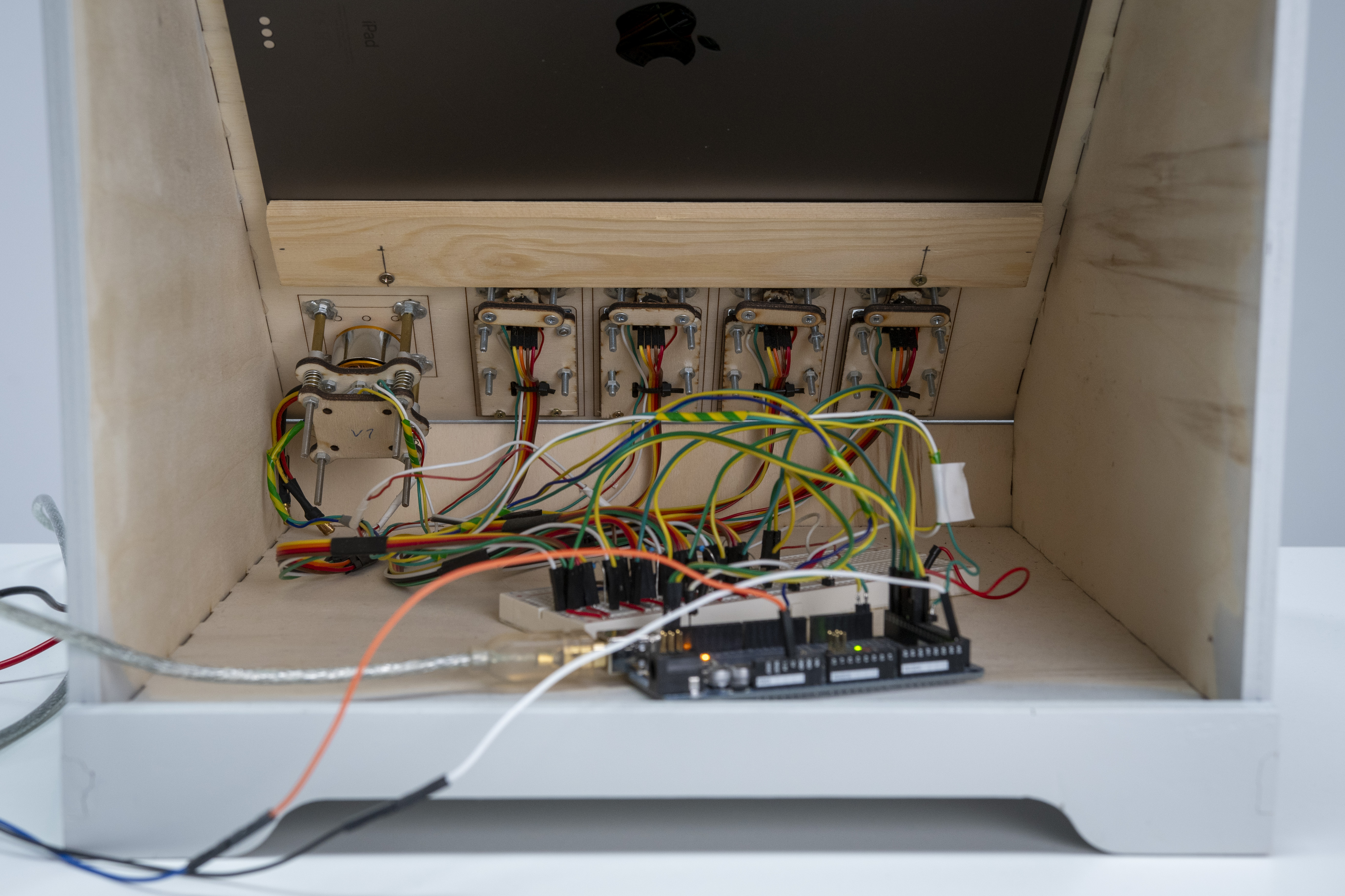
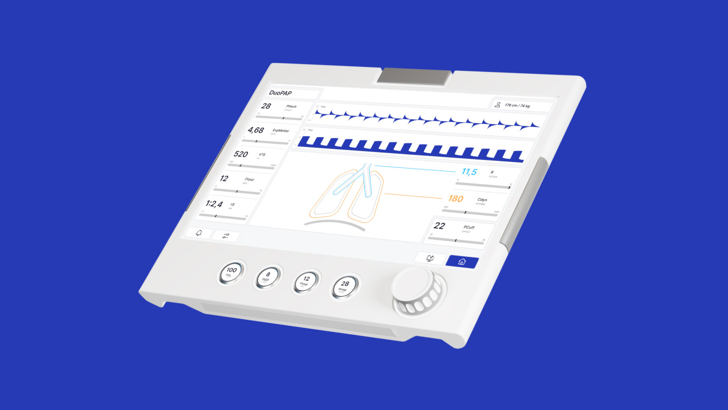
CuraVent

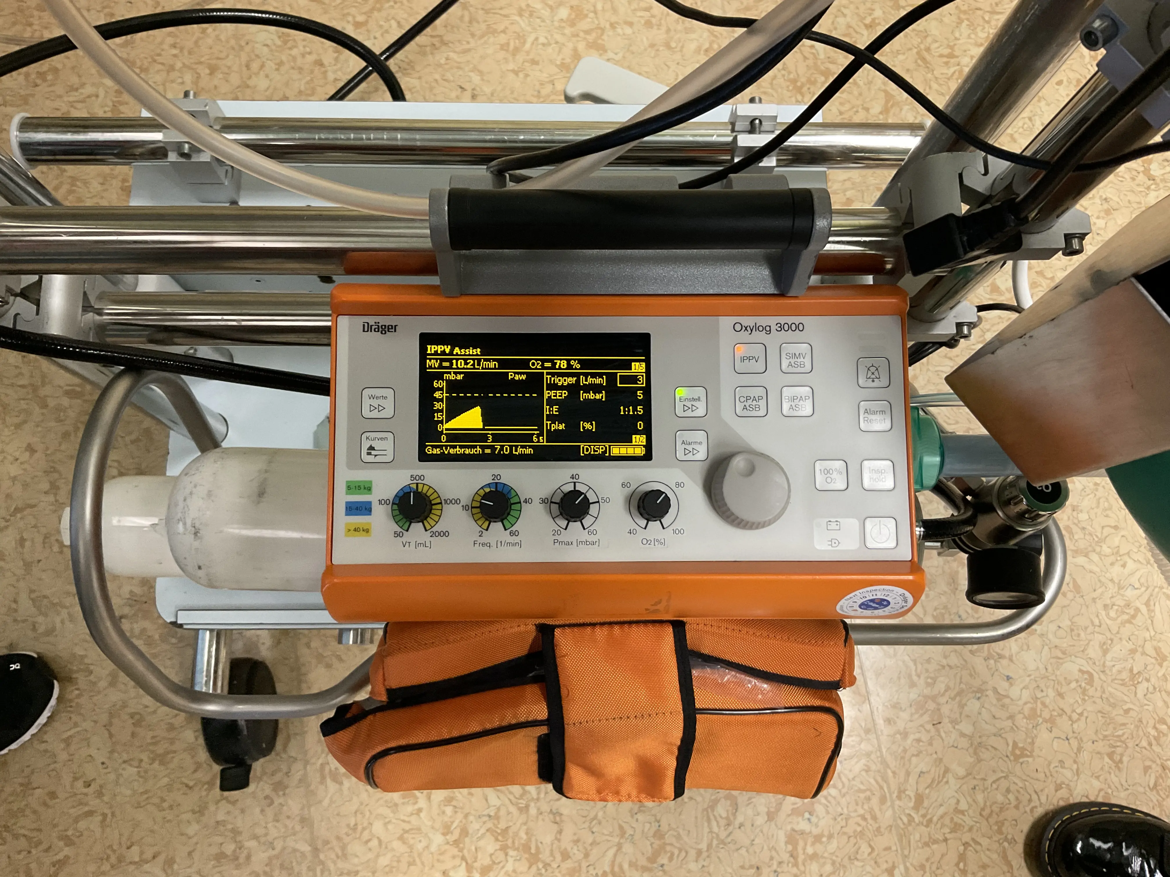
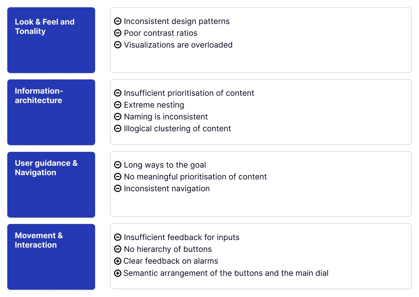
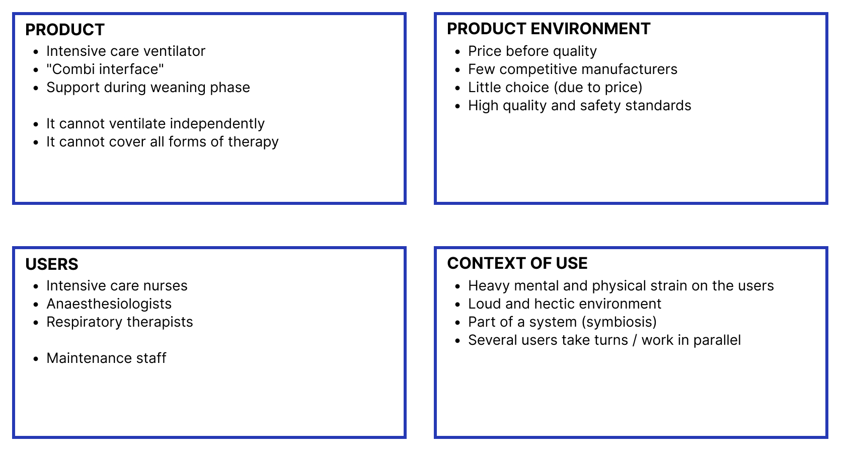
CuraVent is a redesign of an intensive care ventilator. Through detailed user research in a cooperating intensive care unit, profound problems in the areas of usability, haptics, interaction and information architecture are to be solved. The result is a tested proof of concept prototype with rendering.

Empathize

Benchmarking

A total of 4 interfaces of intensive care and emergency ventilators were analysed and their components were dissected according to content- and interaction structures. Below is an exemplary view of the analysis of a Dräger intensive care ventilator.

User Interviews

Qualitative interviews were conducted with 4 medical professionals. The aim was to develop a basic understanding of the work situation "ventilation". In addition, to understand the needs of the user, as well as to find out about unnecessary functions and recurring operating problems. The following Insights were generated.

Field Research

In our field research in the intensive care unit, we had the opportunity, in addition to the user interviews, to spend a whole day being shown and explained in detail various devices by an experienced expert. Also, we were able to experience non-invasive ventilation on ourselves. Here are some Impressions.

Key Findings

The project's research phase lasted over two months, culminating in the insights displayed in the graphic. This visualization represents a concise aggregation of the extensive data collected from the research activities previously discussed. It identifies core issues in Look and feel and Tonality, information architecture, User Guidance and navigation, and Movement and interaction.

Main Idea

CuraVent is an intensive care ventilator with a hybrid interface and clear visual hierarchies that enable targeted user guidance even in critical situations. It focuses on excellent user experience for healthcare professionals in the ICU as opposed to competing devices with inadequate usability.

Ideation

Product Sketches

After the concept phase was completed, we sketched out the first ideas for the final product. Since we decided on a hybrid design, it was important to include both a large display and haptic elements such as quick action buttons and a rotary control as the main interaction elements.
We implemented Quick Actions Buttons as an easy adjustment option for critical parameters during the ventilation.

Prototype

Full interaction

This video shows the complete user flow, from setting patient characteristics and starting ventilation to changing parameters. It shows all possible interactions with the haptic elements and the display itself. After starting ventilation, users are taken to the main view. Numerous values and graphics give a quick overview of the ventilation and the patient's status. Different perspectives enable varying levels of detail.

Quick Action Buttons

Values can be adjusted on the display or by using four Quick Action Buttons. These buttons were implemented to solve the user's frustration of searching through multiple layers of information to change ventilation parameters. Users can modify four crucial and frequently needed values to quickly adapt the ventilation to their patient's current state of health.

Main dial

The main dial covers numerous user needs. On the one hand, it has deep grooves and a plastic coating to ensure sufficient grip when turning the dial quickly, even when wearing gloves. Secondly, it snaps into place when parameters are modified and thus provides feedback as to whether a value has been changed. The increments are software-controlled and adapt to the minimum and maximum values of a parameter. A value is confirmed by pressing the dial, which also provides click feedback. This helps users to actively confirm changes in ventilation and prevent incorrect value changes.

Madness behind

The prototype went through a number of iterations over the course of a few weeks. To enable its functionality, we utilized ProtoPie Connect to link our designs, which were created in Figma, with our hardware.