CuraVent

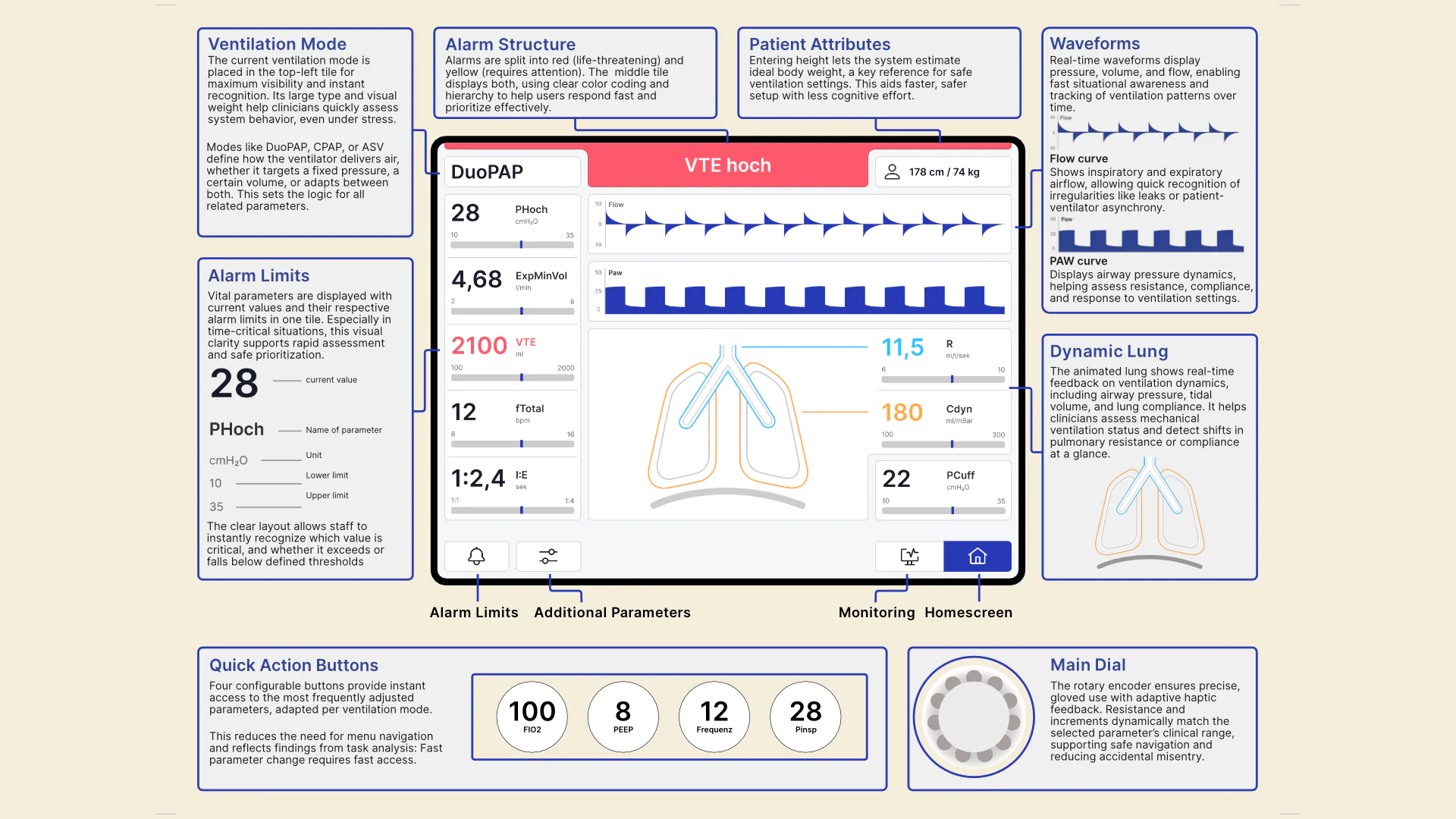
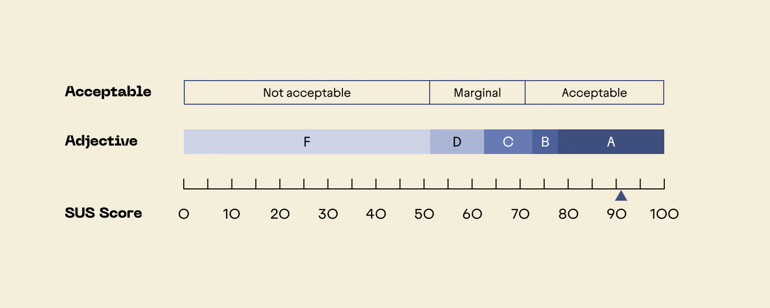
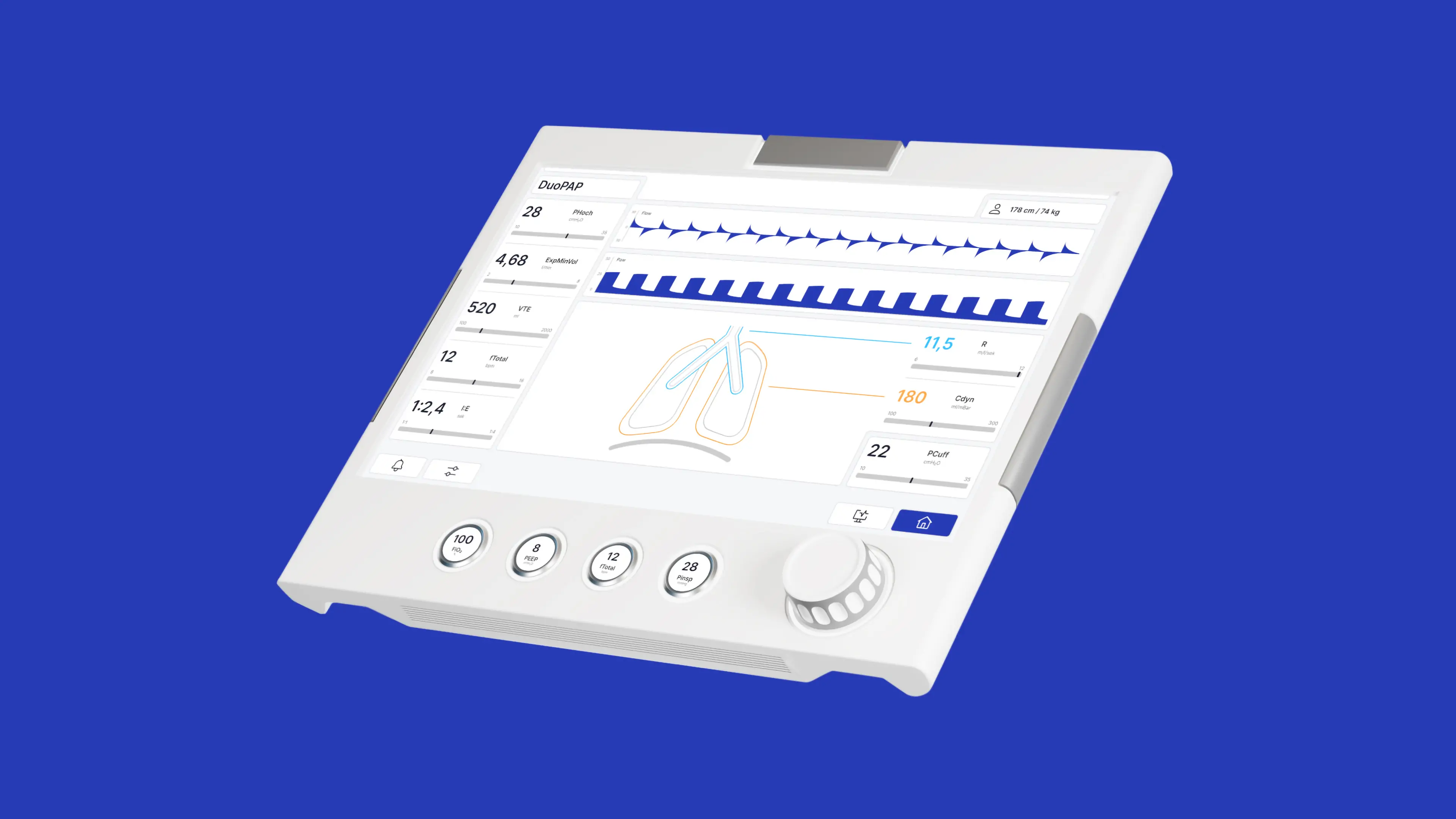
CuraVent is an evolutionary redesign of an ICU ventilator interface, designed to reduce cognitive load and support safe, rapid decision-making in critical care. Based on in-depth contextual research and task analysis, the interface was rebuilt around flat hierarchies, visual clarity, and tactile feedback. I led user research, clinical grounding, and usability evaluation. A hi-fi prototype was formative tested with ICU nurses and anaesthesiologists. Results showed a 40% faster setup time and a SUS score of 92, demonstrating that context-aware design interventions can meaningfully improve interaction quality in high-stakes environments.

The Problem

Many ICU ventilators meet regulatory usability requirements, yet still fail under real clinical conditions. During high-pressure moments, deep menu hierarchies, poorly prioritised data, and inconsistent terminology slow down orientation and increase the risk of misjudgment. Users often receive no clear feedback after critical inputs and must rely on memory to navigate known interface flaws. This cognitive overhead not only causes fatigue but also jeopardises treatment accuracy. Our challenge was to address these frictions at their root — by designing a system that supports clinical flow, not just compliance.

My role

As Research Lead, I was responsible for framing the problem space, grounding design decisions in clinical reality, and leading usability testing. I worked across all HCD phases, with a focus on user research, evaluation, and concept development. My background in critical care supported detailed analysis of workflows and interface challenges. The project was a close collaboration: while I focused on research and testing, my teammates led prototyping and visual design, ensuring a deeply integrated process from concept to interaction.

Methodology

Grounded in a human-centred design approach, the project evolved through iterative cycles of field observation, stakeholder input, and rapid prototyping. Early ICU shadowing surfaced moments of friction and delay in routine ventilation workflows. These insights guided a task-level decomposition of critical user actions and informed the redesign of the interface. Research findings were synthesised into actionable design principles—shaping information architecture, interaction logic, and visual hierarchy. Prototypes were successively refined in response to clinical feedback and tested using a simulated multimodal input setup, striking a balance between conceptual clarity and technical feasibility.

Initial question

How do clinical staff orient themselves in critical situations, and what interface factors help or hinder rapid information uptake?

Method

Qualitative interviews with ICU nurses and anesthesiologists focused on interface experience and decision-making under stress.

Insight

In emergencies, navigating unclear settings and scattered data is cognitively overwhelming. Clinicians need a clear state snapshot, via instantly readable, prioritised visual parameters.

Decision

The GUI and visual hierarchy were redesigned to prioritise system state. Key parameters are now clearly structured and instantly readable, supporting rapid interpretation under pressure.

Initial question

How do workflows and contextual factors shape device use in the ICU, and where do system-level frictions disrupt clinical routines?

Method

Contextual inquiry in a real ICU setting. Multi-day observation of workflows, environmental factors, and device interactions across nursing and anaesthesia teams.

Insight

When seconds matter, devices must be ready. Long boot and setup times lead staff to pre-power ventilators during patient transport — a workaround born from system lag, not clinical intent.

Decision

Boot and setup processes were accelerated. The GUI initialises critical functions instantly to ensure immediate readiness, avoiding time loss during emergency deployment.

Initial question

What recurring UX issues exist in current ventilator interfaces, and how can these insights inform a more precise, safer, and more consistent redesign?

Method

Heuristic evaluation of four market devices. Analysed against established UX principles to surface structural flaws and compare design patterns.

Insight

Deep menus, inconsistent labels, and missing feedback obscure critical info. Key values are visually buried, breaking principles such as consistency, visibility of system status, and error prevention.

Decision

Information architecture and interaction logic were restructured. Content is flattened and grouped by function. Input feedback is now consistent, and navigation patterns were unified to reduce confusion.

Solution

CuraVent’s interface was redesigned around a hybrid interaction model with flat hierarchies, high-priority data zones, and tactile feedback. A central visual layout structures monitoring, alarms, and controls into clearly separated layers. Four Quick Action Buttons provide direct access to critical parameters, eliminating the need for deep menu navigation during acute care. The Main Dial offers tactile and visual feedback through snap-in increments and adaptive value scaling, improving control accuracy even under time pressure. The UI integrates seamlessly into the existing hardware footprint, reducing cognitive load while supporting fast, error-resistant adjustments in real clinical settings.

Quick Action Buttons

In high-stress clinical situations, users must act without searching. The Quick Action Buttons provide immediate access to the most frequently adjusted parameters, tailored to each ventilation mode. Their consistent layout reduces navigation effort and strengthens spatial predictability, aligning with heuristics like recognition over recall and minimal memory load.

Main dial

The Main Dial translates parameter ranges into a tactile experience. A brushless motor provides software-controlled resistance and incremental feedback mapped to the expected value scale of each parameter. This supports precise control and prevents overshoot. The design reinforces users’ mental models by coupling visual scale, haptic rhythm, and physical affordance, supporting safe, mode-agnostic operation under clinical pressure.

Outcome

We conducted a formative usability test with six clinicians across anaesthesia and intensive care. Tasks included alarm handling and initial patient setup, based on real workflow analysis. The redesigned interface resulted in a 40% reduction in setup time and achieved a SUS score of 92, indicating a very high level of usability. Participants noted faster orientation, more apparent alarm prioritisation, and more intuitive parameter adjustment. The layout’s structured visual logic and tactile feedback mechanisms reduced hesitation during time-critical tasks. While further quantitative studies are needed, these results validate key design assumptions and highlight the value of context-aware UI interventions in critical care.

Learnings

Early technical decisions limited us to one ventilation mode for prototyping. More upfront evaluation of feasibility could have sharpened the scope and task analysis. For team members without a clinical background, the learning curve was steep, but essential to engage with the complexity of intensive care processes and terminology. While we lacked the resources for broad quantitative validation, the depth of our research helped uncover root causes and system-level design flaws. It proved that even constrained prototypes can drive meaningful insight when grounded in real-world workflows.